I decided to partake in this challenge over at Clean and Simple Stamping. See their great sketch, and the fun card that Natasha made? Now that’s a style I love and embrace.


Unfortunately, my card turned into a disaster. I got a really fun and springy new set today by inque boutique that I wanted to try out. Don’t get me wrong, they are great images, but I’m pretty positive that my card turned into a disaster. A tacky purple and black disaster resembling something I may have made a few years back (and possibly recycled even then).
Maybe I’m being over critical, as sometimes I can grow to like a card.. but as it stands, I’m not too keen to show this card to the world (hence why I’m hiding it after the link below). It’s just not pretty enough for the front page of my blog! So if you’re feeling super curious or somewhat sadistic, feel free to take a look. **note that all this is moot if you’ve clicked directly to this post. Sorry, but you see the card. No choosing for you!


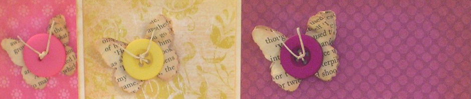
What I’d change for next time? I think my biggest mistake was that soft mauve paper. Maybe I’ll give it a try in white. Also, the texture in the paper that the cut-out butterflies are stamped on doesn’t help their cause.
And really, I think my main issue with the card is that it goes completely against the grain of my style. That’s my love for clean and simple cards. Oh well, it was an afternoon of learning!
And hey, I re-designed my blog because of a million bugs in the previous theme. This one’s growing on me :-)
This card is not a disaster!! It’s super cute! I really like the off-set circles with the black- makes a neat shadow effect. Sometimes it’s good to try things that aren’t in our comfort zones, helps one grow as an artist!
Aww, thanks Natasha. Looking at it this morning I’m liking it a bit better. And you’re right that it’s good to try things outside of ones comfort zone.
Very pretty! I love that the opposite corners are rounded!! Great job with FTL 81!
♥Lea